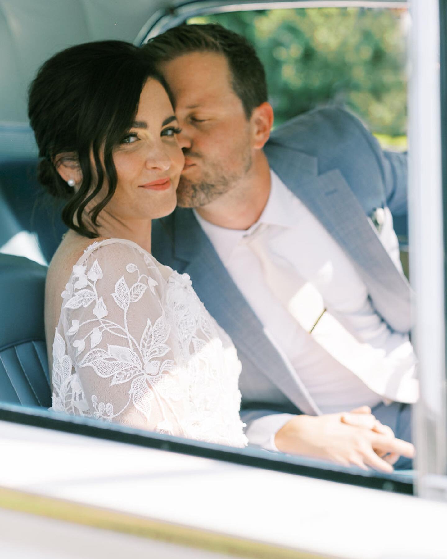
All Things Spring: A Classic and Colorful Florida Wedding

Good things happen when I get to play with color.
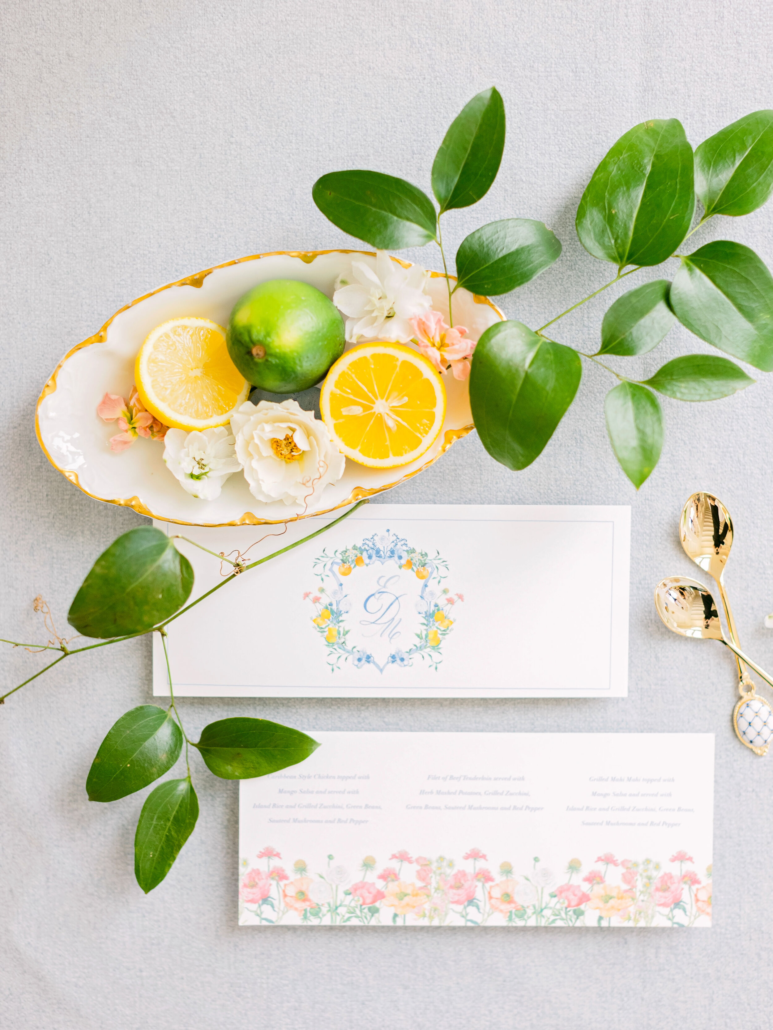
Could there be a better representation of a South Florida spring?! I think not. Working on this invitation suite was an absolute dream - Not only was the bride, Emily, my next door neighbor growing up in Fort Myers, making the creation of this design even more meaningful for me, but her number one request was for the stationery to be inspired by bright and vibrant colors. Um, yes please, she came to the right place!
I will preach the use of color in your wedding stationery or florals until the end of time, you just don’t get the same effect when working within a color scheme of whites with touches of greenery. It is a common misconception that the use of color will make your wedding less classic or timeless - but the design itself is what makes this invitation suite timeless and florals, no matter what color, will always be classic. More importantly color is so powerful when it comes to evoking feelings, moods and emotions. I love to think about how immediately flooded with emotion Emily & Michael will be when they look back on their stationery and photos over the years. It was such a meaningful, tailored design made specifically for them.
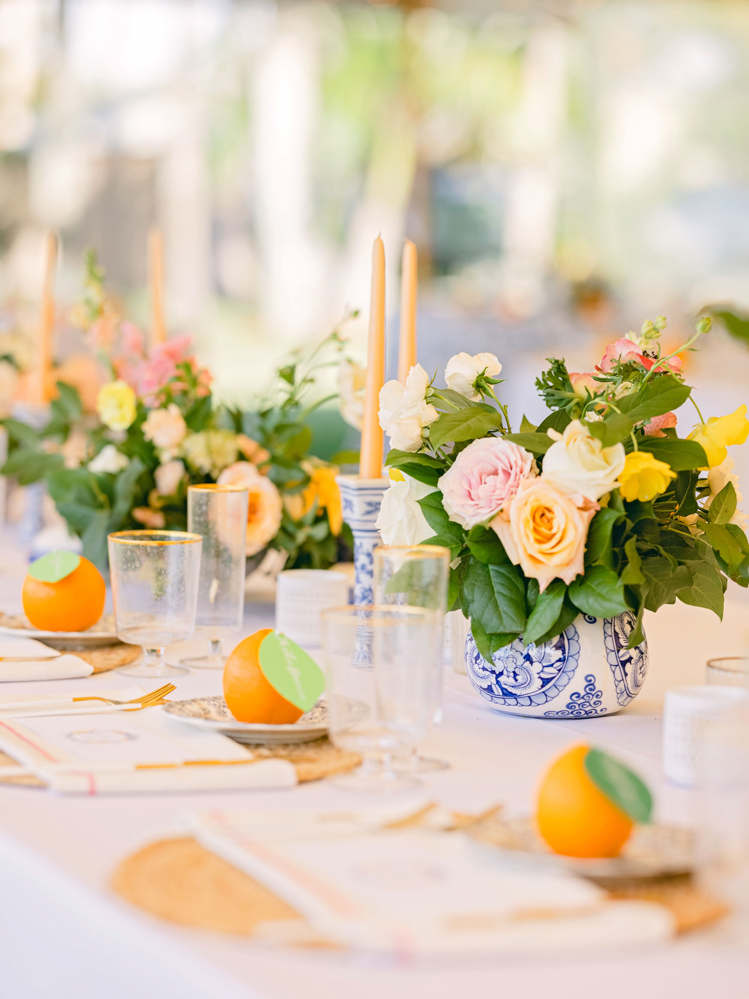
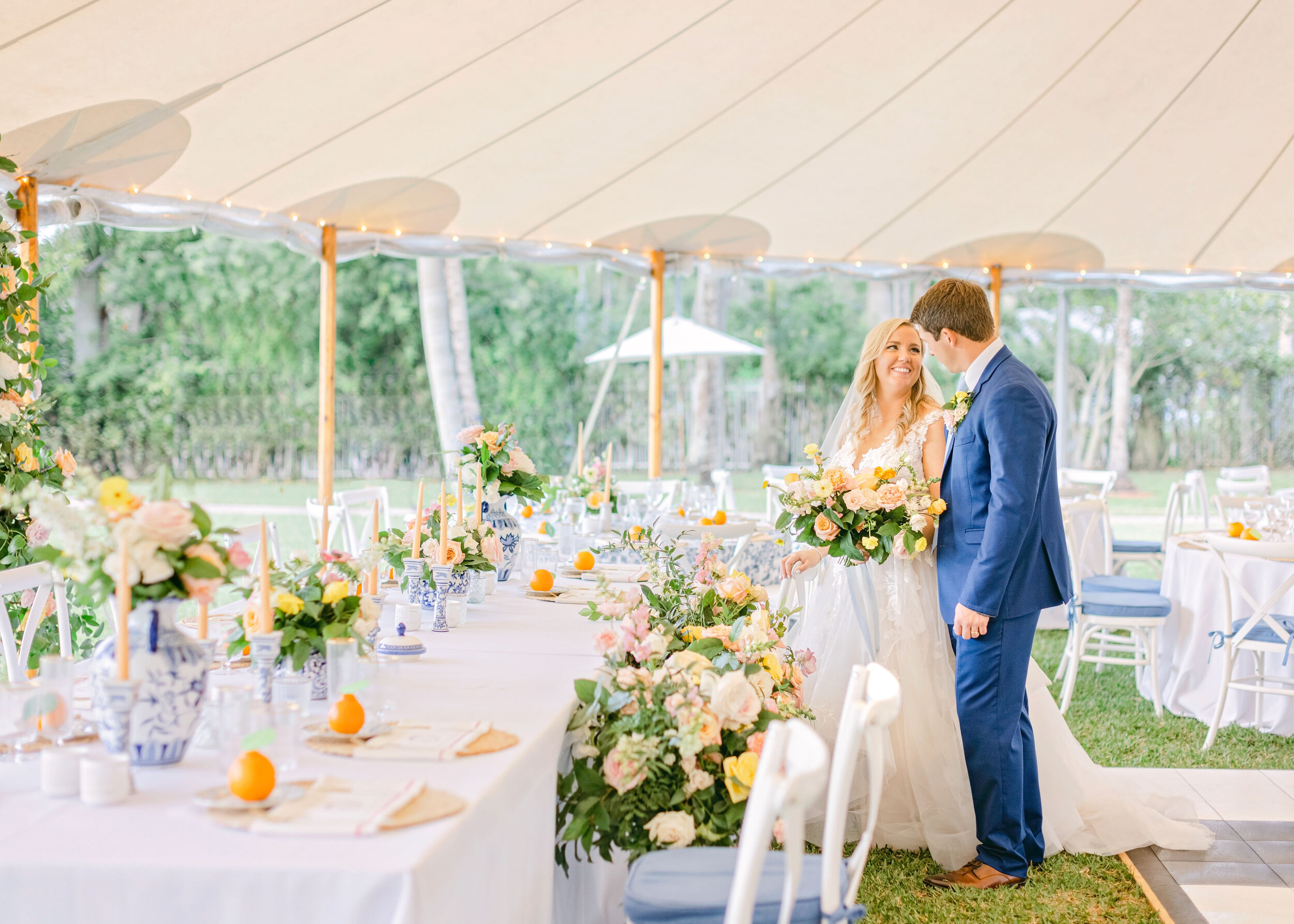
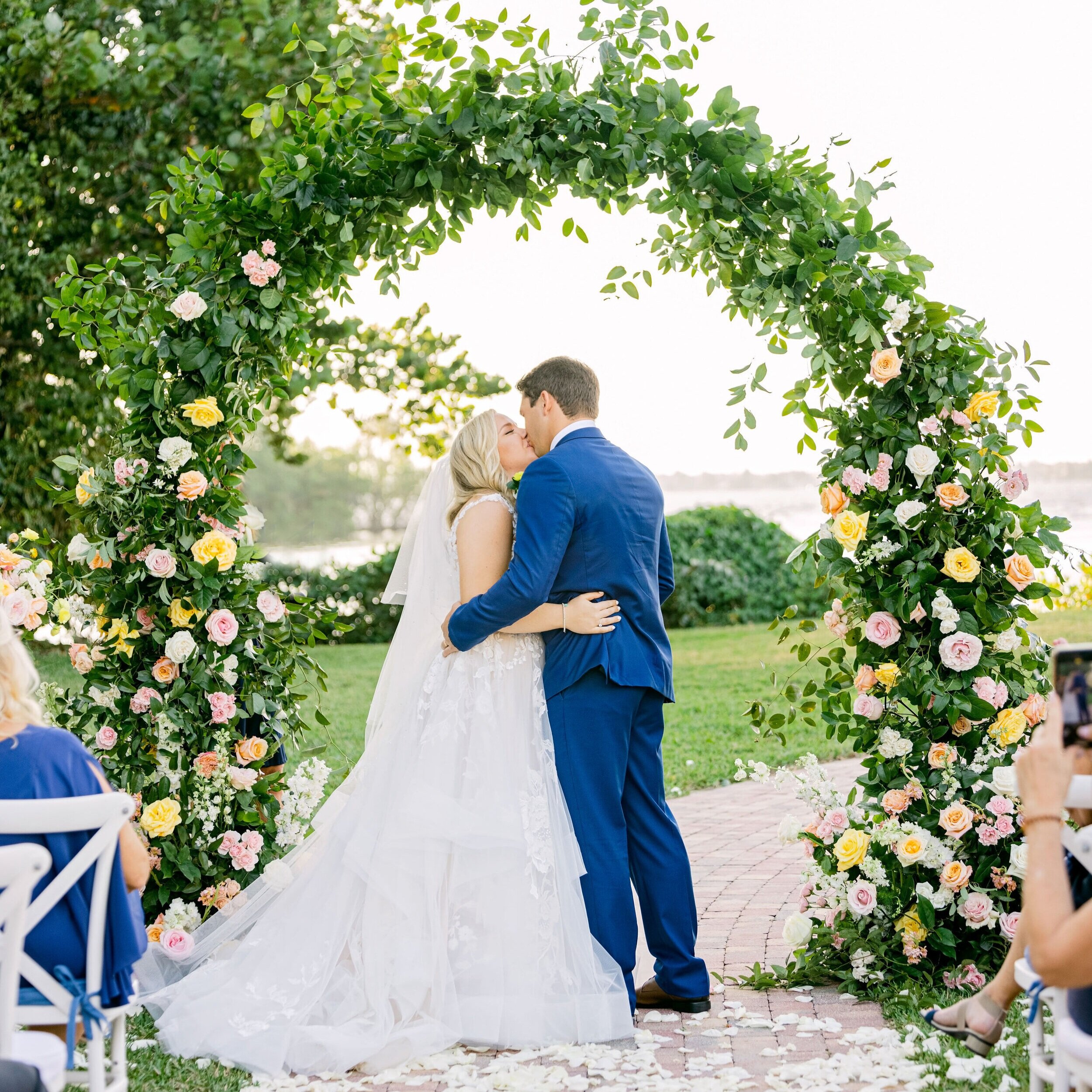
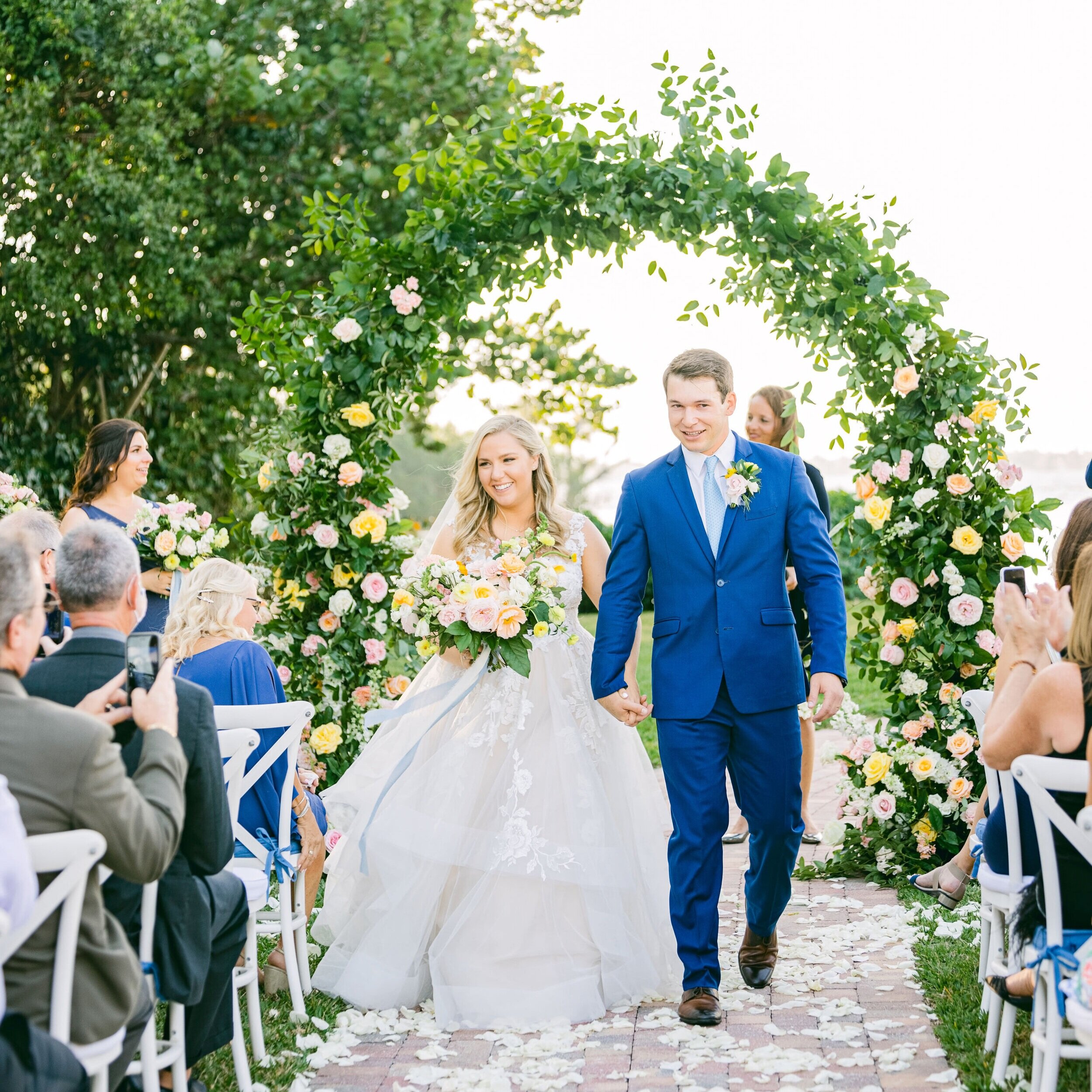
This couple’s stationery was directly inspired by Emily’s bridal bouquet and the floral arch created for the ceremony. Talk about a cohesive design - Although stationery is obviously my favorite element of wedding design, it is not the only element. It is always important to consider the wedding aesthetic as a whole and at a bare minimum, I will want to see those florals!
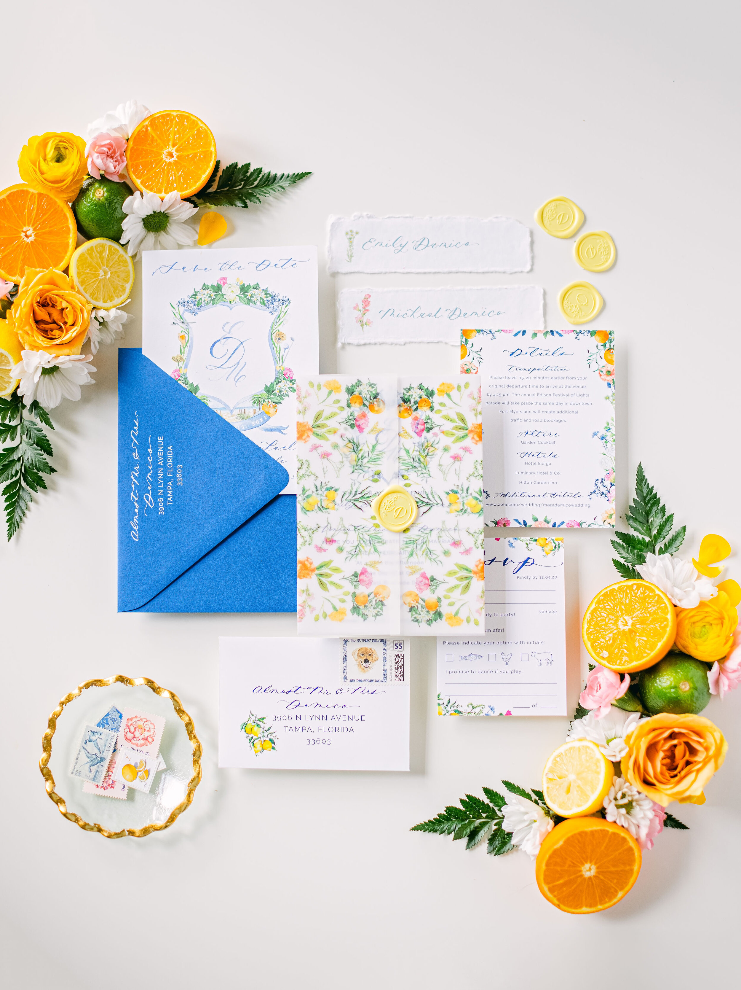
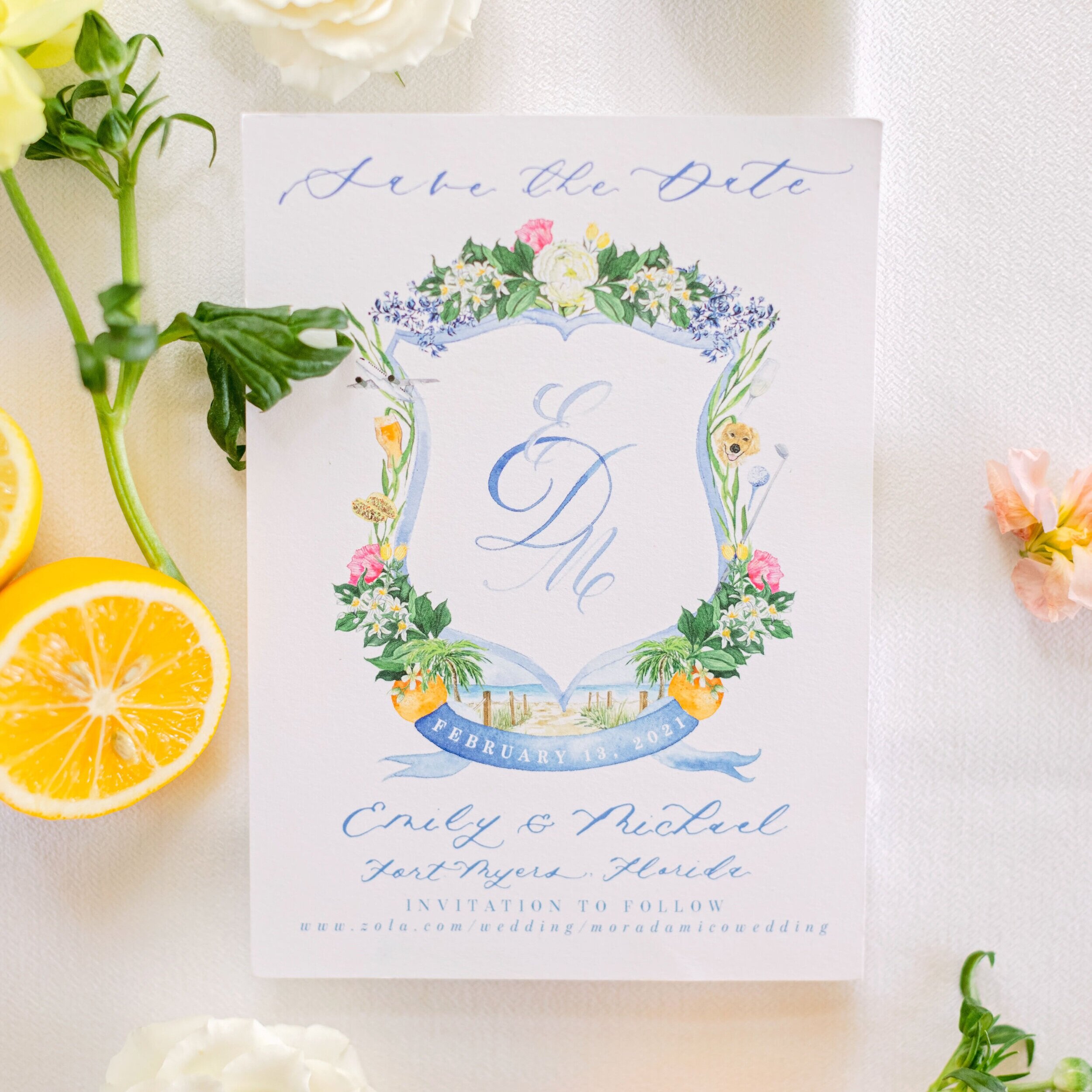
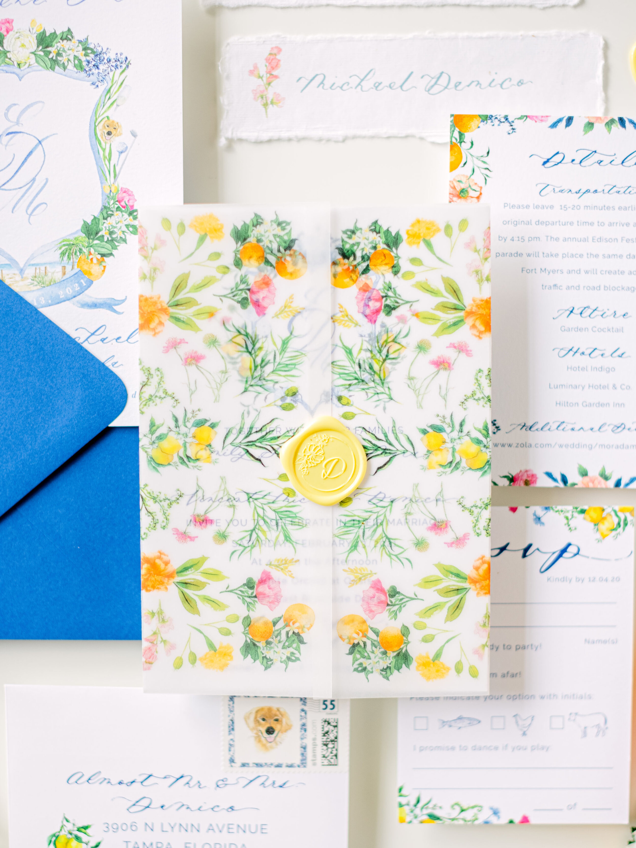
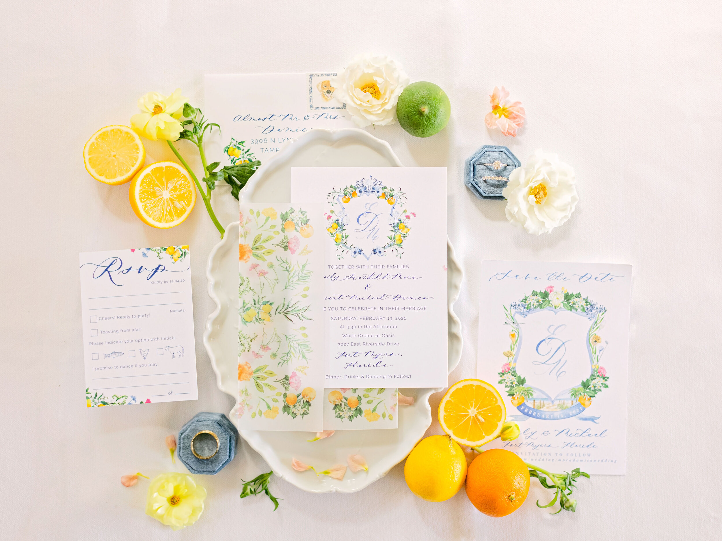
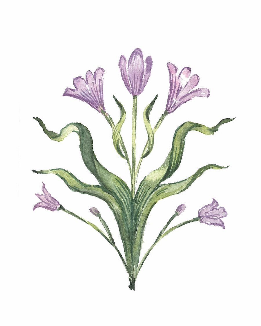
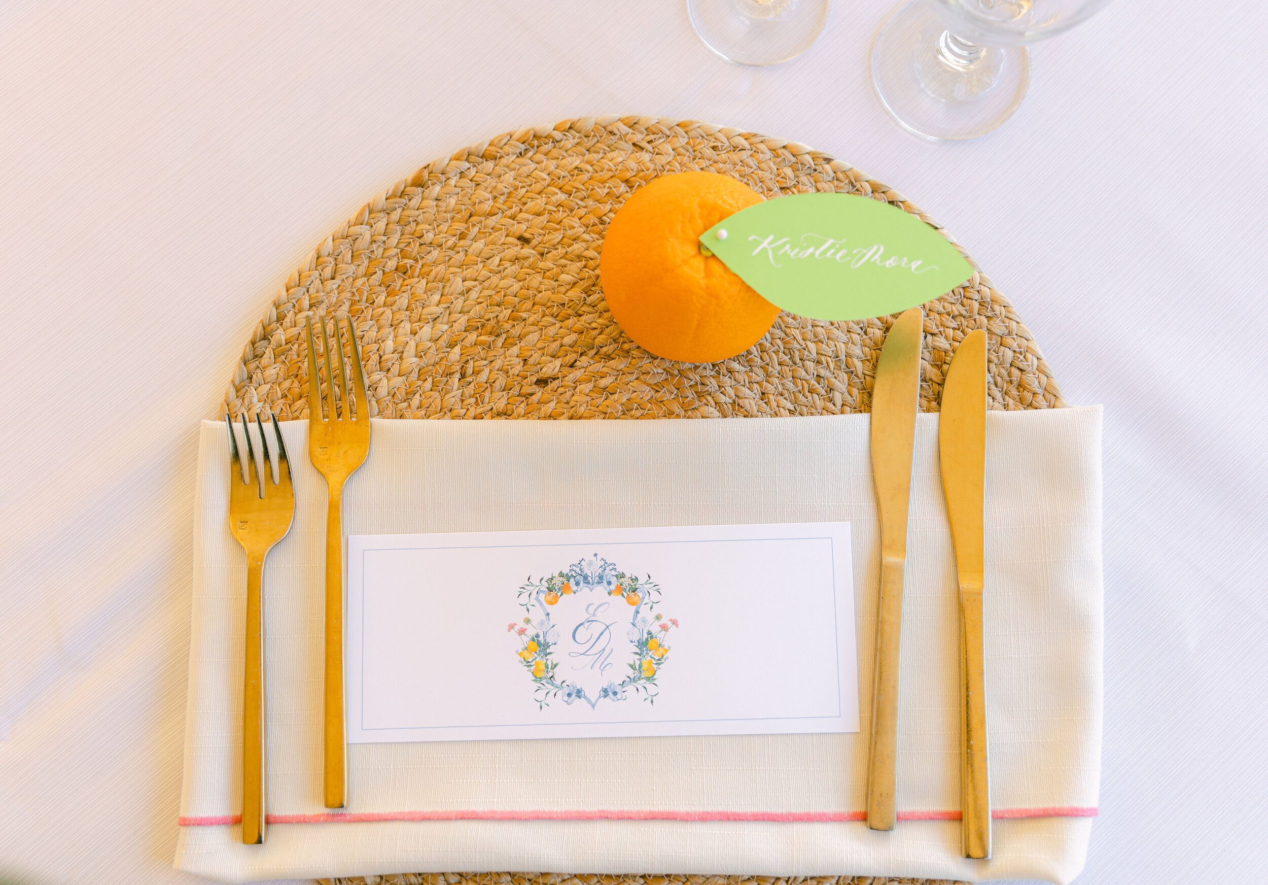
We used a custom designed vellum jacket as the main “show” of the suite and complimented it with a lemon yellow wax seal. The custom monogram crest was a focal point for the save the date and made another appearance in the wedding invitation. Vibrant florals were sprinkled throughout all of the pieces and remaining inserts. The deep blue envelope with curated vintage postage was the vessel for all of this spring loveliness and definitely made this invite stand out amongst guest’s mail.
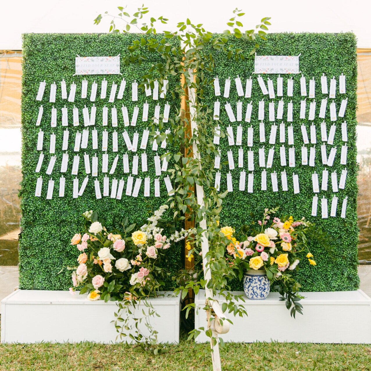
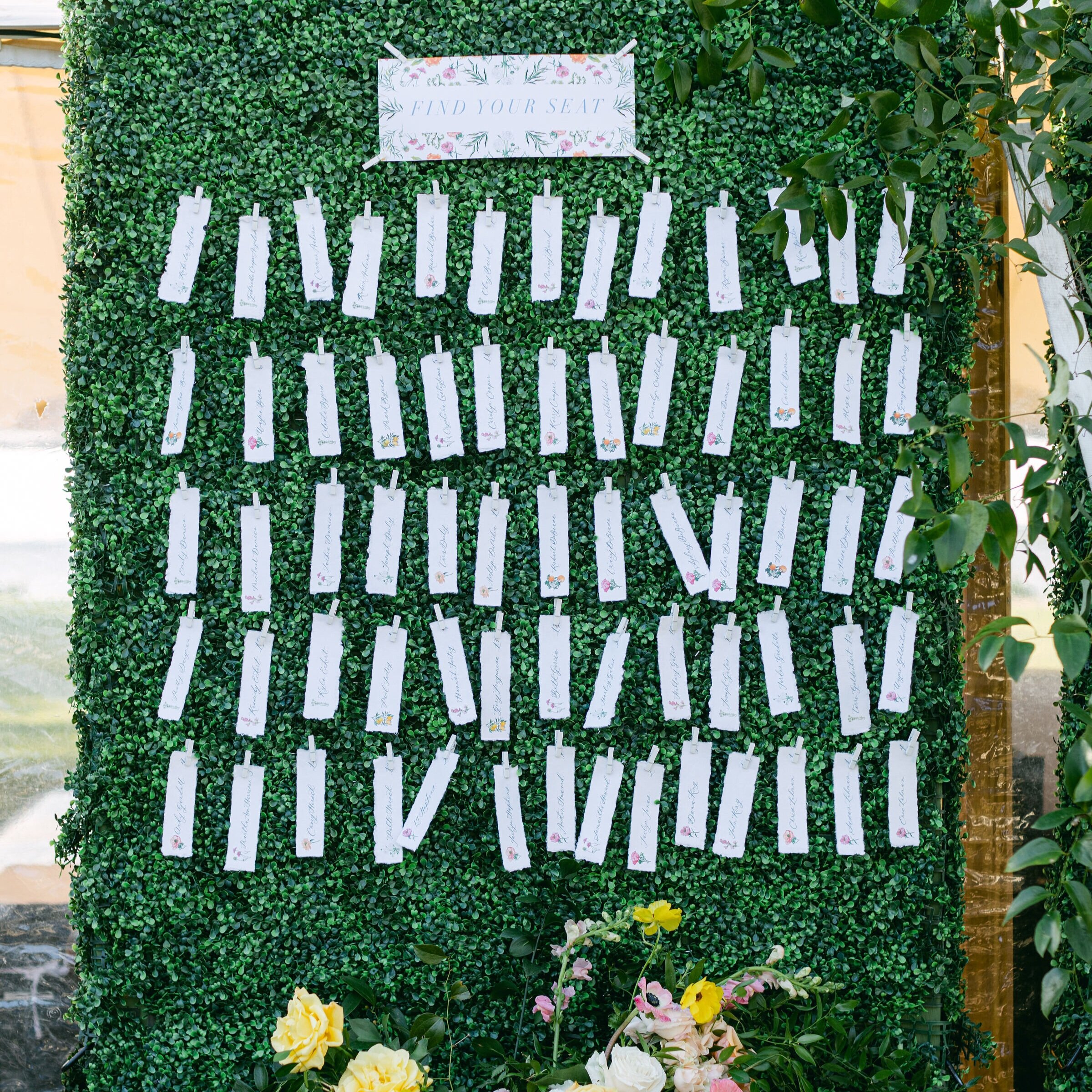
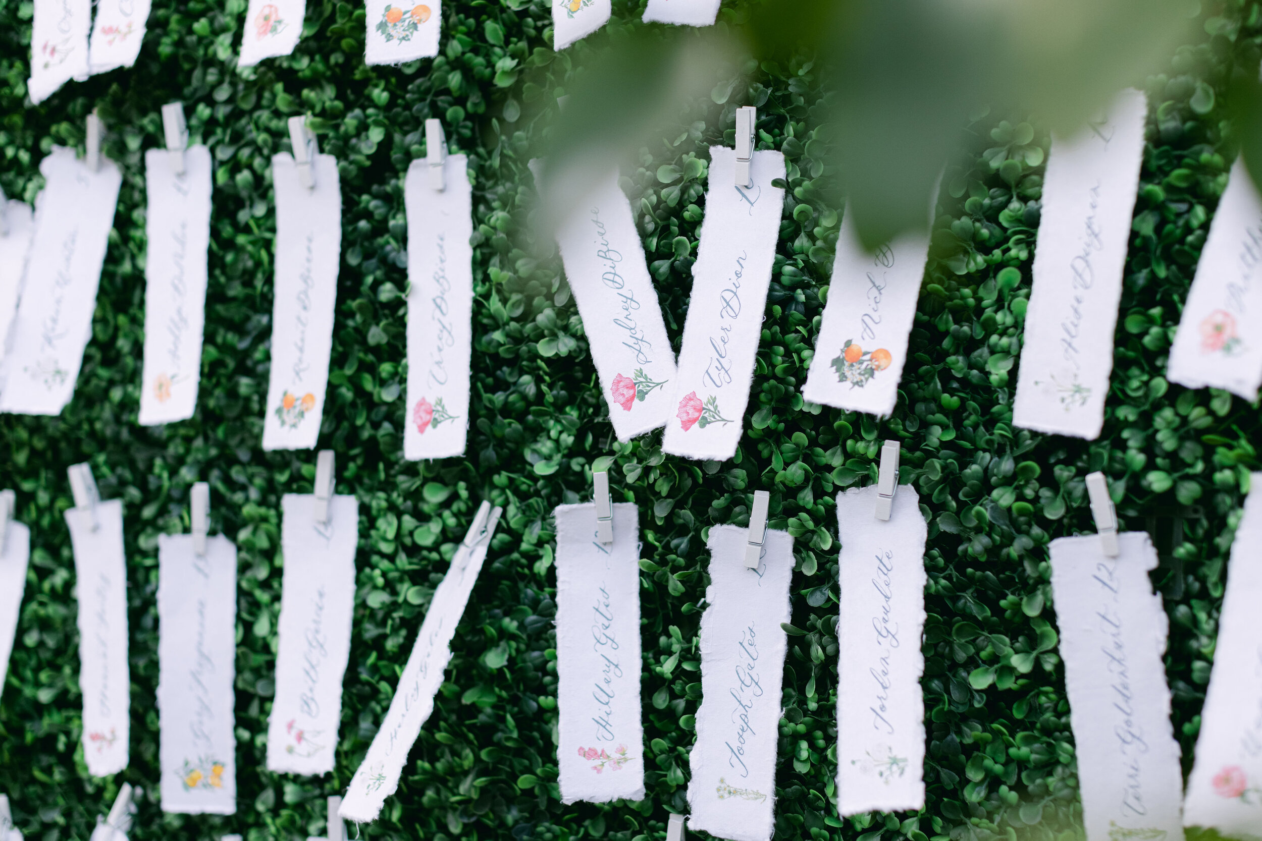
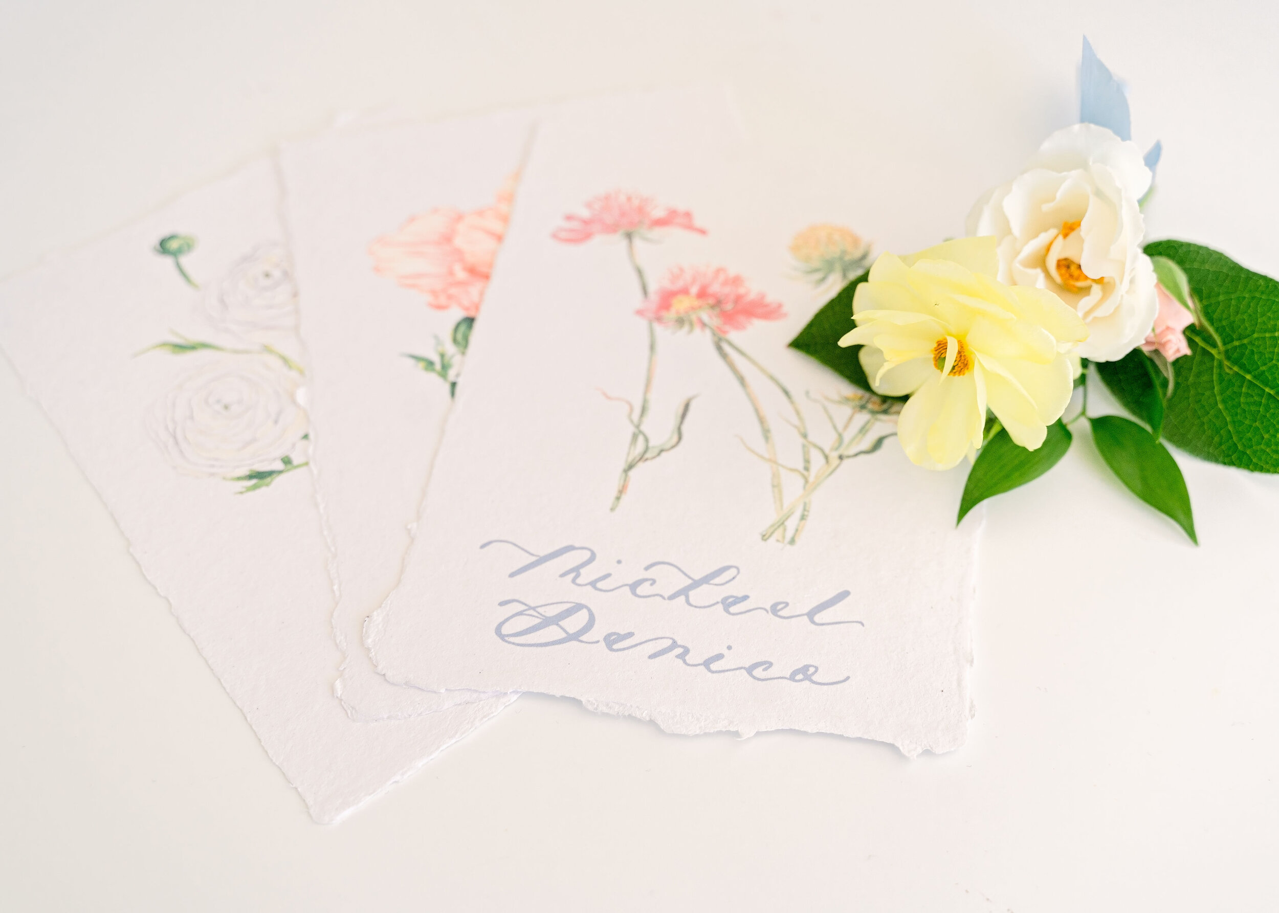
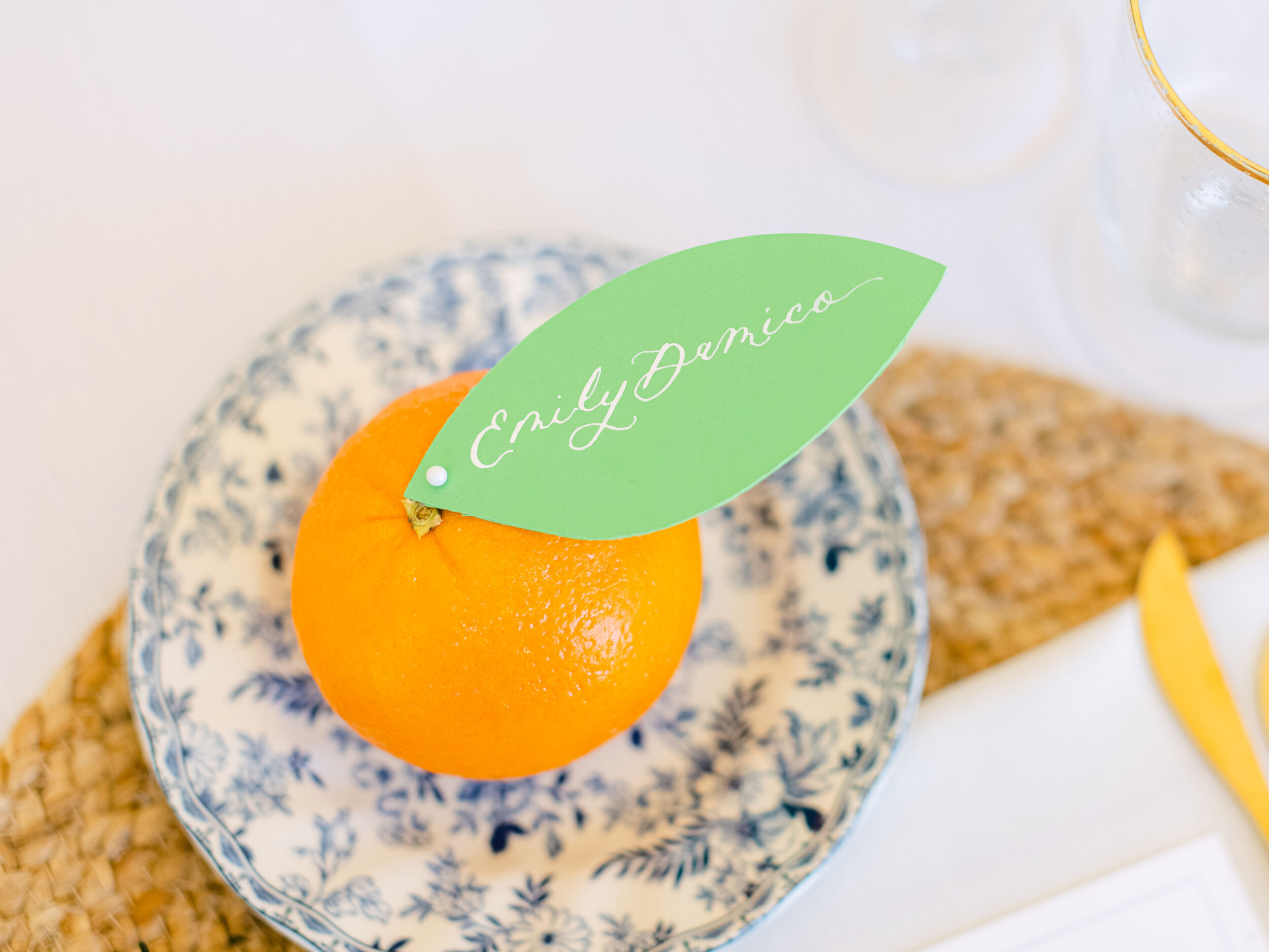
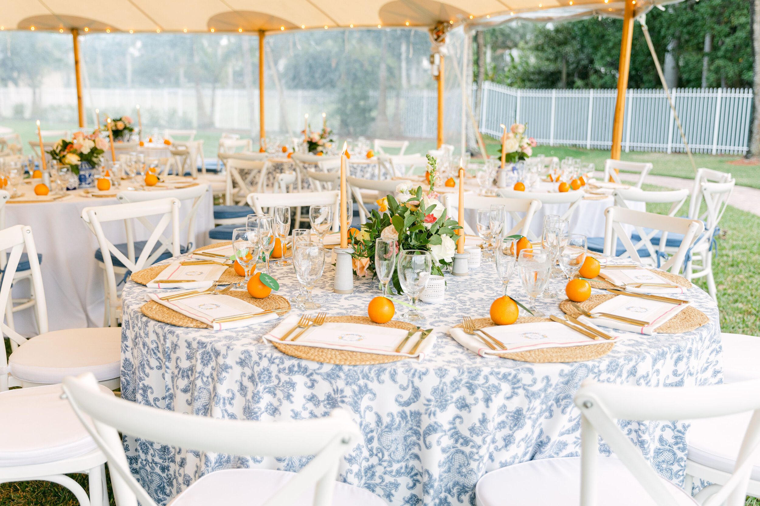
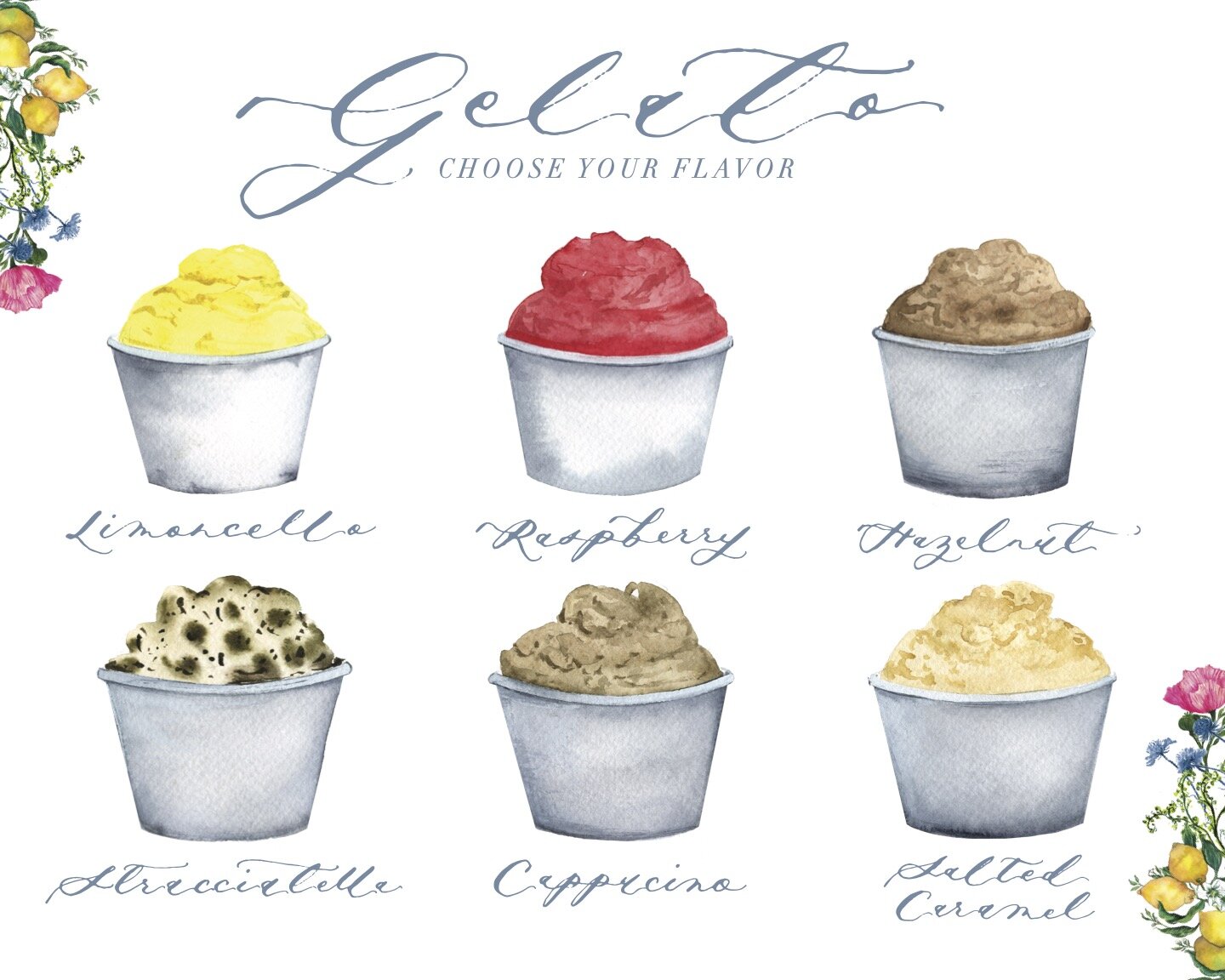
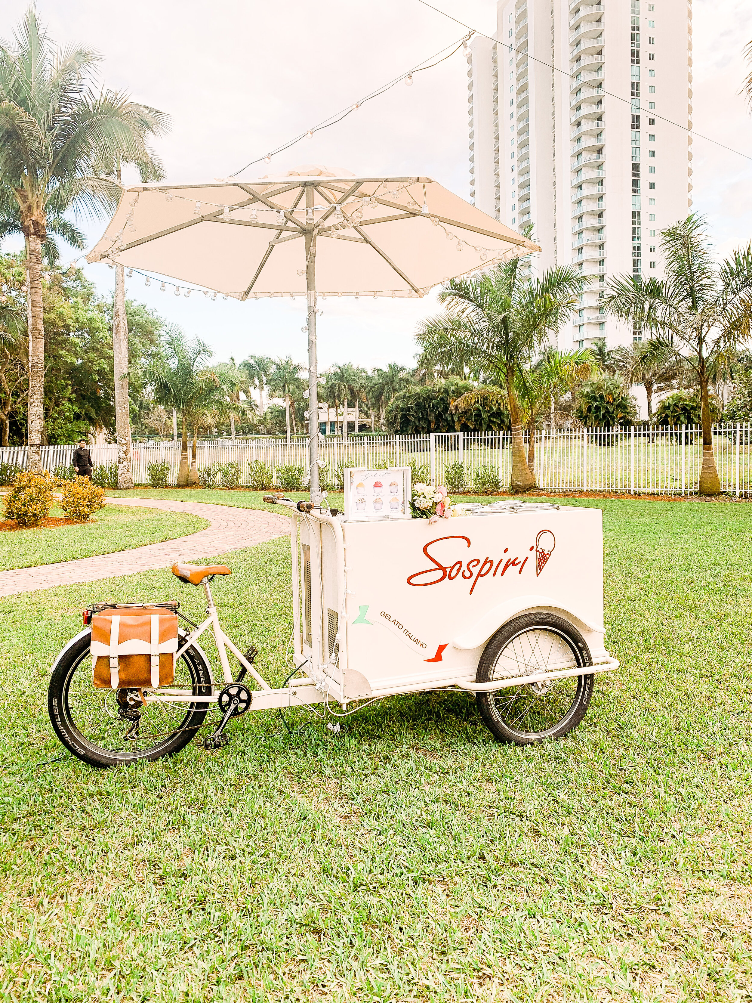
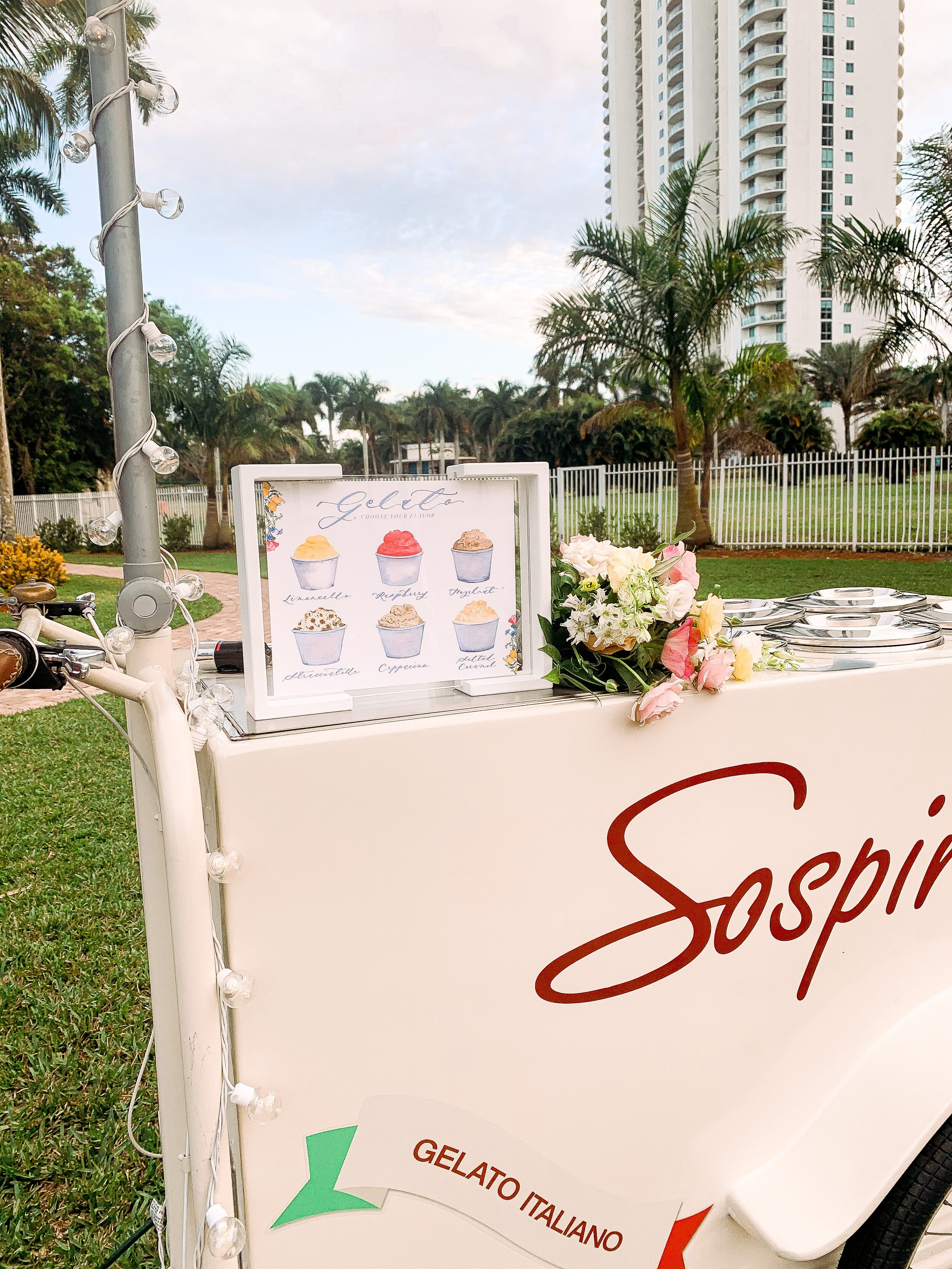
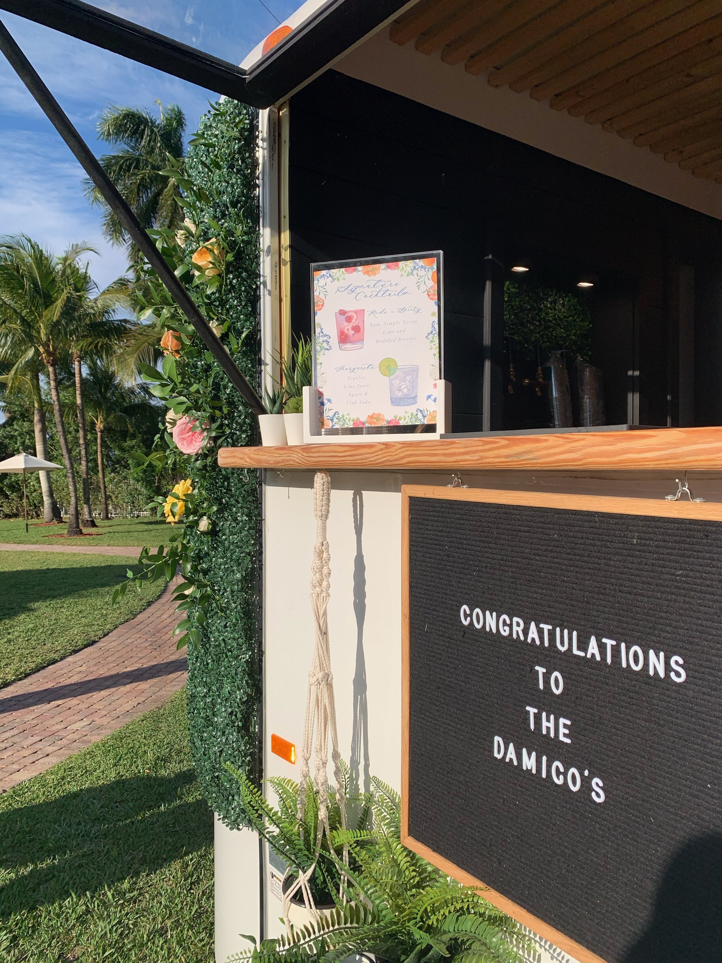
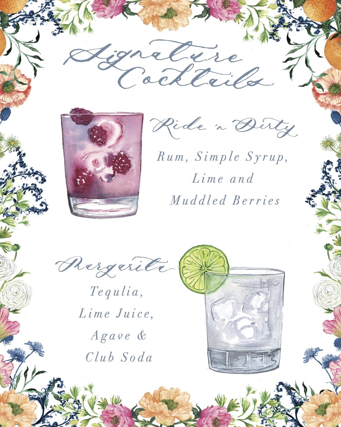
In addition to the invitation suite, I collaborated with the wildly talented + creative Kehrin of Jet Set Wed to create a few additional wedding day details including a handmade paper seating chart installation, custom leaf shaped name cards that were pinned to oranges at each place setting, and custom signature cocktail and gelato cart signage. We wanted to make sure that the day of details added to the overall design in way that enhanced it, rather than being an afterthought.
Creative Geniuses
Photographer: Stella Paschall | @stellapaschallphoto
Event Design & Planning: Jet Set Wed | @jetsetwed
Florist: Signature Florals | @ signatureflorals
Beauty: Duality Artistry | @beauty.by.laurenmichelle
Videographer: All In White Studio | @allinwhitefilms
Live Musicians: Jade Strings | @jadestrings
DJ : DJ Tommy | @thedjtommyg
Gelato Cart: Sospiri Gelato | @mysospiri
Bakery: Sweetified Bakery | @sweetified.cakes
Rentals & Decor: A Chair Affair | @achairaffair
Rentals & Decor: Plithos Rentals | @plithosrentals
Venue: White Orchid at Oasis | @whiteorchidatoasis
Follow Along on Instagram